Thursday, 19 January 2012

ideas - task 2/3

The photos are very grainy because I used a high ISO (1600 or 800) - to avoid this I should use a lower ISO and longer exposure (which I would probably need a tripod for). The last few photos were taken on the bus, hence the reflections and bad focus. Also, it may the lights dont really stand out so much on the town hall, taking the photos later on (when its a little darker) should help.
The photos have very little continuity - there is little or no narrative. This is not helped by the fact that the photographs have clearly been taken in completely different corners of the city center. The more abstract photograph of some windows, although I rather like it, it does not fit in with the other far less abstract pictures.
The reason the photos are so different from each other and have little narratives I was experimenting - I took the photos just to see where I should take the photos and what style I should use, rather than instantly looking to find and use a narrative. I later took more photos when it was darker, then looked at different ways I could edit them. The narrative itself creates the narrative more than the photos themselves.


task 7: evaluation

Task 1: Task 1 should have been one of the easiest tasks to do, but examples of several of the in-camera techniques were sometimes hard to find - especially the stocking/tights over the lens idea; typing stocking  or tights into Google images (for example)more or less exclusively showed hosiery shopping results.

Task 2: Recreating the in-camera techniques was more of a general experimentation with cling film and foil than genuinely trying to recreate images using the techniques. Making the images soft and blurry with cling film was actually quite hard, as the cling film had definite edges when folded over, and my camera kept focusing on the cling film. I ended up using someone else's camera, and it still didn't work so well.

Task 3: Digital production methods vary greatly - there are several different programs  and software, and versions of software, and new versions are being created all the time. This meant that much of the information I found was irrelevant for the version of Photoshop I was using, I mainly messed around with the available effects I found, such as Gradient (next task)

Task 4: for the Health and Safety, I was sat at a desk for the most part of this unit, so wasn't sure what this meant. The editing of these photos was more messing around with Photoshop than hard work

Task 5:Editing the photos in Photoshop was, in fact, fairly easy, although, trying to recreate the tunnel effect was much harder than I expected it to be, although I don't think I may not have have tried hard enough with it.

Task 6: The images I have chosen to use are simply the same images with different edits. The photos are fairly ambiguous - I have left the heads of the 2 girls out of the picture, they could be anyone. The edit style I used makes the outlines - as well as the central colours - stand out.

task 18/1: lens angles

A  wide-angle lens makes the subject look taller and wider, while zooming in makes them look shorter and thinner, possibly than they really are - a close-to picture will also make the cheap bones and chin stand out, and the zoom will almost squash the image. Therefore, a wide-angle lens should not be used for overweight weight conscious people.

zoomed in
wide angle


zoomed in
wide angle
wide angle
zoomed in
wide angle
zoomed in
zoomed in

wide angle
A low angle would be used to make a person seem very tall, or powerful - as the viewer would appear to be looking up at them - while a high angle would be used to make the subject look less significant than something else in the picture, or the viewer - as the viewer would be looking down at them.
wide angle
zoomed in
wide angle
zoomed in

Thursday, 5 January 2012

task 3: digital editing

There are several different editing software out there (Corol Paint Shop, Adobe Photoshop, Serif PhotoPlus etc) possibly the most well used in Adobe Photoshop - at least for teaching purposes. I've been using Adobe.

To soften images - and/or the edges - by going into Image - Blur - Gausian Blur and moving a sliding bar to change the blurriness of the picture. To make just the sides or corners blurry, the picture first has to be duplicated (in the separate Layer mini-wondow on the right of the screen, click and drag the image (labeled background) to the bottom of the column to an icon that looks like a sticky-note pad and hover, than release, the mouse - still holding image - over the icon). Blur the duplicated image, as above, then click on the eraser tool. In the left on the screen, just above the large, blurry image you are using, there are icon you can click on the change the size, opacity and hardness of the eraser. Change the size to about half as tall as the picture is, the opacity to between 5 and 20 (uses a sliding bar) and the hardess (sliding bar also) to around 20 or lower. Over the center of the picture (or where ever you want), click once and use circular motions until you're happy with the effect.


Adobe has a gradient tool (located with the fill tool). Creating a new layer (same icon as to duplicate a layer) and filling it with a gradient  and then changing the density of the gradient. Some of the gradients can over lap, generally creating an interesting effect.

 The colours of the picture can also be changed, using the half-black-half-white circle icon next the new/duplicate layer icon, which brings up a list of options; Clicking on one changes the mini-window above the Layers to sliding bars that change the strength of colours.


There is also the option to Liquify the picture, this gives the option to make a photo look like an ink painting (of sorts) or make the subject of the photo stand out.


http://slodive.com/photoshop/photoshop-tutorials/
http://soft.udm4.com/downloading/romantic_filter_effect_editing_software/
http://photo-editing-software-review.toptenreviews.com/

Tuesday, 6 December 2011

task 1b

Leeds
Recently Martin Parr took photos of many of Britain's major cities in  a project for the Guardian newspaper. This project also included several pictures Leeds - they were not in a narrative form, but constitutes of much of the city - from the prison, to shopping, to Opera North and the ballet at the The Grand. The project was to show the hidden parts of the cities to the public and to document some of the life that went on there.


There are many pictures of Leeds, not by Martin Parr, showing various historic or interesting places (that seem to all be in west Leeds if they arn't in the city center). They all show a different side of Leeds - such as the Bear Keep on Cardigan Road (the castle-like building below) and the Corn Exchange in all its glory.

I quite like the picture above of the canal, but I'm not too
sure about the obvious Photoshopping. I like the lighting
effect its created, but the clumsyness of it ruins it a bit 
(you can see a lighter line all round the inside of the bridge)

Many projects based on city life (that I have found) are films, made with an outsider perspective, or about the cities bars or commercial interests.

http://www.dailymail.co.uk/news/article-2036932/New-York-City-photos-Charles-W-Cushman-reveal-1940s-life-Big-Apple.html
http://www.londonphotoproject.co.uk/blog/
http://citylifefilmproject.com/#/
http://www.magnumphotos.com/Catalogue/Martin-Parr/2008/GB-ENGLAND-Leeds-Guardian-Cities-Project-2008-NN197357.html
http://www.ntileeds.co.uk/events/creative-networks-presents-martin-parr/
http://www.tymchak.com/blog/?p=382
http://www.guardian.co.uk/artanddesign/gallery/2008/nov/01/photography-martin-parr

PersonX
Julian Germain created 'For every minute you are angry, you loose sixty seconds of happiness' a project made over 8 years of about Charles Snelling - an old man who lives alone. The project follows Charles round, showing parts of his life - the photo albums, the kitchen, Charles himself. The photos seem very sensitive to the man at the center of them. The photos are colour, which seem to try to show the world as it is, and to show Charles to be a colourful man (which Julian Germain mentions in the prologue with the photos)


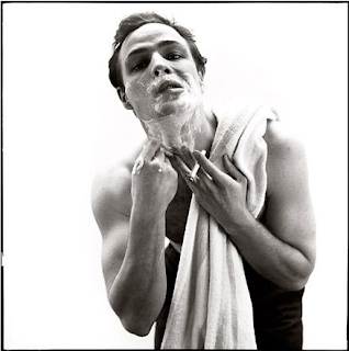
Richard Avedon photographed people out of their natural surroundings - this lack of back-drop gave the people a staged quality, whether they were or not, and took away the supporting personality, giving them an almost 2D quality. His pictures are always taken in a studio, everything is under his control, so that the subjects act. The photographs are still trying to be sensitive to the subject, but at the same time are not.


http://www.juliangermain.com/projects/foreveryminute.php
http://www.guardian.co.uk/environment/gallery/2011/may/12/martin-parr-floods
http://iconolo.gy/archive/great-richard-avedon/1304

Government Cuts
The recession has lead to the current government making large cuts to government spending - in education, benefits and the NHS - and increases in taxes, such as VAT. There have been a number of protests as a direct result of this - such as virtually the whole country on strike on the 30th December, the riots this summer and the university fees protests last summer.

Lack of money or government funding has been at the hart of all politically motivated art for decades, much of the satirical cartoon found in newspapers deal with the current political issues - such as If... by Steven Bell in the Guardian G2Steve Bell's If …
Steve Bell's If… 02.11.2011


http://www.yorkshiredailyphoto.com/2010/12/topshop-protest-leeds.html
http://www.guardian.co.uk/commentisfree/cartoon/2011/nov/13/1

Friday, 2 December 2011

task 3/5: replication of in camera techniques using Photoshop


 Cling Film Effect:  I prefer the Photoshop version (above) to the 3 others, I found using the cling film quite hard, as it constantly creased awkwardly and my camera originally kept focusing on the the cling film, which also ruined the effect.


For the tunnel effect I prefer the original version, made with a tube of foil around the camera lens, as opposed to the version I put together using Photoshop. The photoshop version looks flat and unconvincing 


Using stockings or tights to darken a picture - the picture with a diamond pattern across her chest uses actual tights, the one without was edited with Photoshop. The distorted feature are barely noticeable due to the size.