I see photography a quicker version of drawing. Having done both Art and Design and Media Studies at A-Level, photography seemed a natural route to go down, combining the main aspects of both subjects.
I have really enjoyed all the work we've done on the course, especially the light pictures; my group were able to take some spectacular pictures. Walking around taking pictures has been really fun as well, it's completely different from the structure I had last year at A-Level. The studio work with Dervyn has been interesting as well; last year, for my Media Studies project, the film made was almost all in shadow - we filmed at an old house in Headingley instead of a studio, but learning more about lighting has be fun.
All the teachers are really nice and don't seem aloof, like teachers normally seem to; none of them are intimidating, although willing to still tell people off for being late etc. They seem to prefer creative teaching, or letting us teach ourselves a bit, which is good for a creative course. I have always found actually doing what I’m supposed to be learning much easier to memorise than being told how to do it.
The fact that most of the teachers are working or have worked professionally is also very encouraging, knowing that they are speaking from experience, and not saying what they have just been told to say.
I have enjoyed learning about the different camera functions and more about how cameras work. Knowing more about cameras and picture taking has changed what for and how I tend to use my camera. Its also been nice to learn through trial and error as opposed to being told what and how to do something by a textbook, and not being able to test it. Its also very different to learn in a group after 2 or more years of working solitarily, its more useful than I expected, as well as a bit more fun.
So far we have learnt how to use aperture and shutter speeds; and how to use them to our advantage. Such as a slow shutter speed will leave light trails and needs a small aperture otherwise it will overexpose; a fast shutter speed will capture split seconds of movement, and is used extensively in sports photography, it uses a large aperture so that the photograph does not underexpose. A large aperture is also used for macro work, the larger the aperture, the closer to the object the camera can be; the smaller the aperture, the further away the camera has to be, this is often used for landscape work.
I quite like that we have been told how to take photos, but that we’ve not been pushed in to any specific objective - other than to help us learn the how of what we’re doing. That has been fairly open to personal preference - although it has been made clear that our own freedom of choice will be limited in the working world.
I would say that so far the course is for me. Hopefully it should get even more interesting after the half term when project work starts.
Monday, 31 October 2011
End Project
Proposal
So far we have learnt about manual photography, aperture, shutter speeds and how to use them for different ideas and pieces of work. Example: for light painting the shutter speed has to quite long and the aperture small so that the picture is not over exposed; for macro or movement pictures wide apertures are needed - for macro because the camera can get closer, for sport because the shutter speed needs to be short. Both need fairly high ISO numbers.During the half term, I will be going to Newcastle. I would like to take pictures of the architecture, as cities all look very different. I will be photographing the city center the most, I have looked at some pictures of Newcastle on the internet and the city center seems to have very interesting and beautiful architecture in it. As a class we investigated architectural photography with Tim, and aperture and shutter speeds have been covered in almost every lesson with Tim, Tom and Dervyn.
Newcastle


In these 3 photos I changed the aperture: 2.8, 4 and 8. I was just seeing which aperture would b best to use, but I quite like the way it changes the light in such a way as to completely change the feel of the picture.
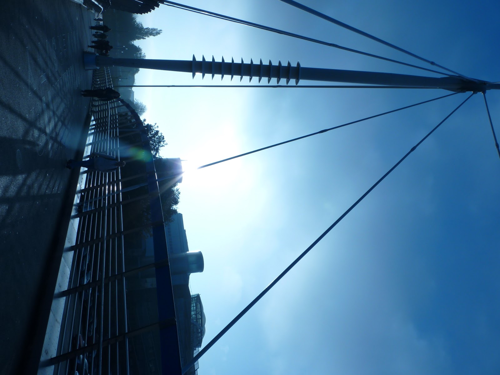
This footbridge between 2 halves of Northumbria University I found very interesting, the spike in the middle, how the footpath leads the eye to it, and then the spike into the sky.
The subject was a piece of architecture, and as architecture was the main thing I was aiming to photograph, I feel that the pictures of and on the brigde comply directly with my proposal.
The limitations of this bridge were mostly due to human error and that it is a public footpath, and therefore many people were consistently walking across who did not necessarily want to be in the photograph or would stand in exactly the wrong place.

The pictures have bleached because I had the camera on the wrong light setting - white balance does not affect the colour - or doesn't work


In the pictures with the trees, I like how the shape of the tree is mirrored (or mirrors) the shape of the building behind

The picture of the statues and trees do not quite meet the criteria of architecture, despite showing the University of Northumbria in a positive and creative light


The windows of this building interested me most, despite the beautiful architecture itself; the curved bottom floor windows, with original wooden frames put the stone work to shame


These two churches were situated almost opposite each other,one picture shows a tree once more taking the shape of a building, the other the sheer size of what was probably a farile modest church to begin with.
The dustbin truck pulled up as I was taking the photos, I liked the composition so still took the picture instead of leaving it.


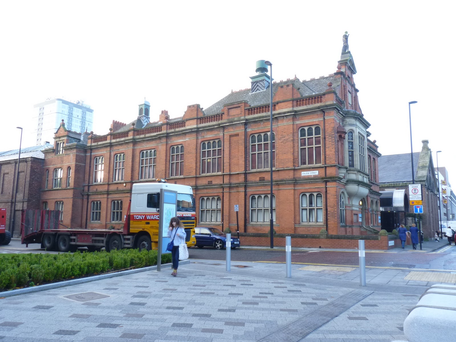
The large red building was simply impressive, it was huge and beautifully built. It was almost comical to see the much more modest and homely building opposite


This very large old church was next to the very new Haymarket and Newcastle University, as well as opposite the towns war memorial


The bus station, I was able to make it look longer than it was from the angle and showing the stalls


The molding/carving on the Moss building was beautifully picked out by the sunlight, but there was not quite enough sunlight for the smaller alleyways


The large gold clock was over a jewelery shop - called Goldsmiths. The fairly ornate clock covered in gold leaf was apt for the shop


This large, severe building was at odds with the buildings and streets opposite. It looks like a mill, whereas opposite was all shops and cafes.


the view in two directions of a street


quaint little streets, not quite back streets but still interesting


It was sad to see so many uncared for buildings that were either crumbling or being torn down


Near a little square I found, there was a small back street that lead back to one of the main high streets, it was full of cafes and shops


I decided to take some pictures at night as well as during the day, the spots of light, as opposed to fairly even light, always seems to make somewhere look more magical than it really is.


I've kept the blurred version of this picture as its somehow nicer than the focused picture, and seems to represent what everyone was doing at the time I took the picture.
The Life center was unexpectedly quiet in the night time, although across its courtyard a light net had been pulled across, which initially confused me, as the night was cloudy and they looked like over sized stars


Night photography is far more limited than daytime photography. The lack of light restricts how you take the photo - you need a longer shutter speed and tripods, or somewhere to steady it. Lights needs to be used, which either carrying one or more around or relying on whats provided.

The mostly black photos were taken from one of the bridges over the Tyne, they are mostly city scapes or of the near by railway bridge casting reflections over the water. This is not fully in keeping with the architecture idea, but they are very pretty so I have still included them.


Although, the cityscape does become more obvious a few photos later


I'm not sure how strongly this relates to architecture, since the picture is mostly road due to the long shutter speed meaning the camera had to be set down to avoid blurring; I don't have photoshop on my home computer.


Again more about the bridge than the city surrounding it.
Either the business or art school of Northumbria University, and the motorway passing next it.


Evaluation
For the most part I met the objective I set out for myself in the Proposal. My my priority was architecture, which I left a little towards the end of my study. I expected to spend most of my time in the city center, which I did, but I also ended up going a lot further afield than originally planned.I think I should have taken a tripod with me, I would have been able to take more, and more sophisticated pictures of the center at night, instead of having to try to find somewhere to perch my camera - which tended to be my knee. I should also have been more aware of what light setting my camera was on, as the first few photos were blue tinted, making them look cold and poor quality.

Subscribe to:
Comments (Atom)